2 Cents: Same but Different
I saw the Bechers' "Landscape / Typology" mini-exhibit at MoMA last weekend. Much has already been said about it given the Bechers' prominence. (Slate, e.g., has a slideshow essay by Christoper Benfey).
The typologies are, of course, very familiar by now. And though familiarity sometimes breeds contempt, I found a few water towers worth chuckling over. I couldn't find a decent web image from the MoMA show, so here's one from the Getty: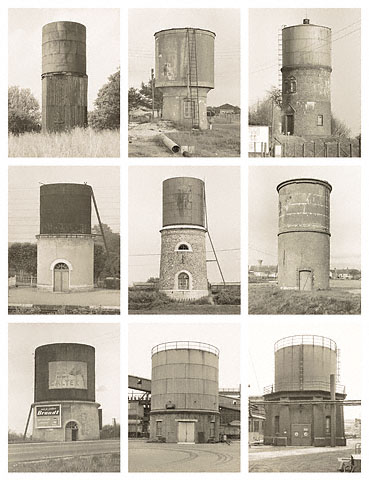 And another set from the Guggenheim:
 What is their attraction? For me, the typologies appeal by showing us -- in a way that only photography can -- how much wonder there is in the world, even in the mundane corner of vernacular industrial buildings. The Bechers remind us that we do not know these everyday objects as well as we thought we did (or as well as we should), and they generate in us a sympathy for the objects. These humble things are similar, but not at all the same. They are individual. They are akin to portraits of human beings, of those who built them.
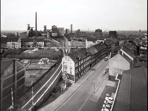 All depict the conjunction of industry and residence. And though one hears a disapproving tone, the images appeal well beyond that.
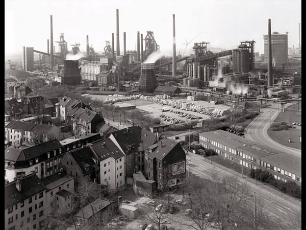 One landscape particularly grabbed me, though, because it reminded me of something I'd seen before. I couldn't find a web image, so here is my (very poor) photo of it:
 I can't recall where this image was taken, but I believe it was somewhere in Pennsylvania.
This of course is a 1935 image by Walker Evans (taken during an FSA-sponsored jaunt) entitled "A graveyard and steel mill in Bethlehem, Pennsylvania."
Similar, no? Both images start with a graveyard in the foreground, move to living quarters, and end with factories in the rear. Death, life, work. I don't know at first if the Bechers had Evans in mind when they took their photograph in the 1970s, but I suspect so (given the locale), but was told by my friend that they did, indeed. Same but different.
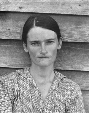 Entitled "AfterWalkerEvans.com/2.jpg," I copied this Evans / Levine from the website afterwalkerevans.com. (I know - who's the author now? Does Internet cutting-and-pasting suffice for authorship? Discuss.)
 I'd like to think that this photograph's focus on the humble materials from which the grave marker is made, and the surrounding context, rescues it from cliche. But maybe not -- it's a fine line. Works for me.
The perspective-enlarged cross, found in the Evans, is definitely cliche. To prove it:
 Isla Mujeres, Mexico, December 2007.
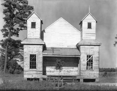
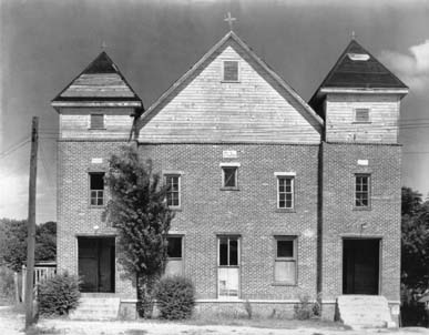
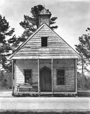
Maybe all this merely confirms something that I've been thinking the last few weeks: Walker Evans is the father of us all. Indeed, even the Bechers' typologies remind me of Evans, especially his images of the southern "negro" churches from the 1930s. OK, OK -- he didn't put them together in 3x3 or 4x6 grids. But if he did, wouldn't these convey a similar meaning as that carried by the Bechers' typologies (well, different but same)?


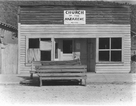
 Add these three Evans (via Sherrie Levine, via AfterWalkerEvans.com), and you get a pretty good typology:




0 comments:
Post a Comment